One carbon total is not enough. If you cannot see what was measured, what was estimated, and what was left out, you cannot judge how much trust to place in the number.
Here’s the short version: I’d treat each emissions line as one of three labels - set and measured, material but incomplete, or excluded. That gives deal teams, boards, and verifiers a plain way to spot weak areas fast, especially in Scope 3, which often makes up about 75% of a company’s footprint. And with financed emissions often 100 to 700 times larger than a firm’s own footprint, poor line-level data can affect pricing, plans, and review.
What matters most:
- Label every material line, not just the total
- Use the weakest input to set the label for that line
- Show exclusions openly, with the reason written down
- Focus first on the largest weak line, because that is often where the risk sits
- Do not mix metered data and rough proxies into one headline number without saying which is which
A simple way to think about it:
| Label | What it means | Usual data type | What I’d do next |
|---|---|---|---|
| Set and measured | Based on primary or supplier data with a stated method | Metered data, checked inventories | Use it with more confidence |
| Material but incomplete | Partly based on direct data, but gaps remain | Physical activity data plus secondary factors | Ask for better source data |
| Excluded | Left out after a stated assessment, or not calculated | No figure included | Check the reason and size |
The main point is simple: I would not judge carbon quality from the blended total. I would judge it from the weakest material line.
That is the lens this article uses.
Where unlabelled carbon data creates risk
Common weak points in Scope 1, Scope 2 and Scope 3 datasets
Scope 1 often depends on self-reported activity data instead of metered readings [1]. Scope 2 often leans on location-based electricity factors only. Scope 3 still drops back to spend-based MRIO proxies, which is a Score 4–5 approach [1].
The gaps usually show up in purchased goods and services, capital goods, upstream transport, and use-of-sold products. In manufacturing, logistics, and consumer businesses, these can be the biggest lines in the inventory. So when they are missing or based on rough estimates, the inventory is incomplete - not lower.
That’s why line-level labelling matters. It works as a control, not just a reporting detail.
Why verifiers and scorers go straight to the weakest material line
Verifiers don’t begin with the headline total. They start with the weakest material line. Using the Inventory Management Plan, they check which sources are material and how each one was quantified. If a weighted data quality score comes in low, that pushes them to inspect the evidence trail behind those lines more closely [1][3].
The GHG Protocol is clear on one point: excluded sources must account for less than 5% of total emissions. Go past that without a sound reason, and assurance can fail [3]. One omitted material category can weaken the whole inventory, even if the Scope 1 and Scope 2 figures look solid.
Put simply, the weakest material line sets the score. A strong denominator doesn’t cancel out a broad sector proxy for emissions [1].
The next move is simple: label each line before scoring it.
What weak data quality means for valuation and governance
When a company shifts from a spend-based estimate to activity-based measurement, reported emissions often increase. Why? Because high-level proxies tend to understate the actual footprint [1]. If a deal was underwritten using the lower estimate, there’s a good chance decarbonisation costs were priced too low.
For boards and investment committees, the issue is defensibility. If no one can say whether a figure was metered, modelled, or excluded, the control environment is weak.
sbb-itb-6ca8558
A simple labelling system grounded in recognised standards
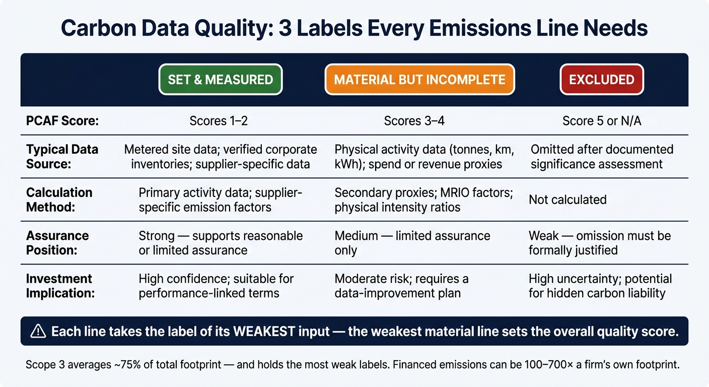
Carbon Data Quality Labels: Set & Measured vs Incomplete vs Excluded
From PCAF scores to three labels

Once the weak spots are clear, the next step is simple: label each line so people can see what they’re dealing with.
PCAF’s 1–5 data quality score can be boiled down into three plain-English labels: Set and measured, Material but incomplete, and Excluded. Each one maps straight to a PCAF score band. And each line should take the label of its weakest input.
That matters for one reason: it shows, at a glance, where better data will make the biggest difference next year.
What qualifies as each label
Set and measured (PCAF Scores 1–2) means you have primary activity data or supplier-specific data backed by a documented method. Think metered energy, verified inventories, or supplier data checked by a third party. This is the strongest label. It is ready for high assurance and gives the deal team the first line they can stand behind with confidence.
Material but incomplete (PCAF Scores 3–4) covers lines where some primary data exists, but the picture is still patchy. That might mean physical throughput data, such as tonnes produced or kilometres driven, while emission factors still come from secondary sources or only part of the line is covered [1]. Hybrid methods usually land here. Where possible, physical-activity estimates should be used instead of spend-based MRIO proxies [1]. This middle band is where most inventories tend to sit, and it’s usually the next place to focus data work.
Excluded (PCAF Score 5 or omitted) applies to non-significant categories, or to sources left out after a documented significance assessment [2]. If a material source is omitted, the reason must be written down clearly. Excluded lines should be visible at board level. They should not just disappear into the model.
Comparison table: the three labels in practice
The table below shows how the labels work in practice.
| Label | PCAF Score | Typical data source | Calculation method | Assurance position | Investment implication |
|---|---|---|---|---|---|
| Set and measured | 1–2 | Verified or unverified corporate inventories; metered site data | Primary activity data; supplier-specific emission factors | Strong - supports reasonable or limited assurance | High confidence; suitable for performance-linked terms |
| Material but incomplete | 3–4 | Physical activity data (tonnes, km, kWh) or spend/revenue | Secondary proxies; MRIO factors; physical intensity | Medium - limited assurance only | Moderate risk; requires a data-improvement plan |
| Excluded | 5 or N/A | Omitted from the inventory after significance assessment | Not calculated | Weak - omission must be justified | High uncertainty; potential for hidden carbon liability |
How to apply the labels in due diligence and portfolio work
Build a carbon ledger by scope and category
Once each line is labelled, move it into a ledger the deal team can use day to day. The three labels only start to matter when they are tied to something concrete: a structured document where every material emissions source has its own row.
Those rows should follow the standard scope structure: Scope 1, Scope 2, and the relevant Scope 3 categories. A practical ledger should record the boundary, the data source, the calculation method, the reporting year, the PCAF score, and the final label.
Label each row by its weakest input.
Scope 3 needs extra care. It makes up an average of 75% of a company's total carbon footprint [4], yet this is also where most inventories show their weakest labels. That's usually where the biggest data-gap work sits.
Use the labels across the deal process
Once the ledger is in place, the same labels can guide screening, diligence, investment committee review, and post-close action. The point is simple: use the ledger at every stage.
At initial screening, the label tells the deal team what the carbon figure is based on. During confirmatory diligence, a row marked as material-but-incomplete turns into a direct data request. You can see what is missing and what would move that row up the hierarchy. At investment committee, the ledger gives a clean view of which lines are strong, which are weak, and which are excluded with justification [2]. The weakest material lines stand out straight away, which makes them easier to rank.
Post-close, the ledger becomes the baseline for the 100-day plan. Improving one large position from a Score 4 estimate to a Score 2 reported inventory can shift the portfolio's weighted-average data quality score more than improving several smaller positions combined [1]. In practice, that makes the weakest material lines the first place to focus in the next workstream.
How the review workflow works
Building a carbon ledger by hand takes time. Company documents usually contain the raw material, but pulling out the right details, checking them against each other, and tagging every row in a consistent way is slow work.
Axion Lab supports that process. Its platform handles extraction, cross-referencing, and label assignment across scope categories, with every deliverable reviewed by a senior sustainability partner. The workflow is built for EU and UK private equity, with framework fluency across SFDR and CSRD, so deal teams working to tight timescales have a clear and defensible basis for decisions.
Conclusion: make the weakest material line next year's priority
Once the ledger is in place, the next step is simple: decide which line to fix first.
A top-level carbon total can make the data look cleaner than it is. But that single figure doesn't tell you much about quality. What matters is whether each material line is:
- set and measured
- material but incomplete
- excluded
And that label needs to reach the people who rely on it.
That is why the weakest material line gets the most scrutiny. Verifiers, LPs and investment committees tend to go straight to the weakest material line: the largest emissions category with the weakest data. That is where uncertainty and assurance risk tend to pile up [1].
Key points for practitioners
As you move into the next reporting cycle, four things matter most:
- Use the ledger to act on the weakest line first. Don't lean on the blended total. Label every material line by its weakest input so the uncertainty stays visible [1].
- Document exclusions with a calculation showing they stay within the 5% threshold [5].
- Target the weakest material line first. Use emissions-weighting to spot the largest weak line - often a PCAF Score 4 or 5 - and make that the priority for the next reporting cycle [1].
- Improving one large, poorly documented position will usually shift the portfolio's weighted-average score more than improving several smaller ones combined.
The aim is not perfection. It is a clear record of what is set and measured, material but incomplete, or excluded.